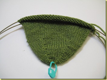
I’ve started my second Lorilee Beltman sock: Our Paths Cross. This pattern was published in the latest issue of Sockupied (Spring 2012). It uses the same vertical stranding technique featured in her Thistle and Forest Plaid Socks. For these socks, I need one main color and two path colors.

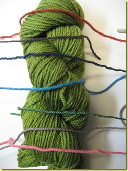
I won’t need to begin the crossing paths until after the heel, so I have a while to ponder colors. Here are my choices:
- Brick
- Chocolate
- Deep Sea
- Turquoise
- Green
- Mocha
- Pink
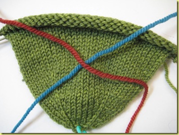
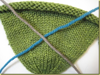
Obviously (if you know me), my favorite is the Turquoise. Which of these other path colors do you like best with turquoise? I’m afraid the Mocha may be too light, but I’m including it here anyway. The Green definitely does not provide enough contrast so I ditched it already.
Oh wait, I just found another color I have in this yarn: Chartreuse. But I don’t like it against the Wheatgrass, so I won’t even bother photographing it.
The polls are open! Vote now!


I was leaning towards Chocolate, but I think I have to cast my vote for Brick.
ReplyDeleteBrick has the best contrast, I think.
ReplyDeleteI agree with Bonny. If you want a more muted effect, go with chocolate. But the brick will pop more. Either will look fabulous. I'll be following this closely, 'cause I totally want to make a pair.
ReplyDeletePersonally, I love greens and blues so I vote for Deep Sea. But if you want contrast, I'd go for Brick.
ReplyDeleteI vote Mocha
ReplyDelete